전 직장에서 web3 관련 커뮤니티 서비스를 담당했었다. 사용자가 프로필 이미지를 NFT로 설정하면 육각형으로 표현해 줘야 하는 데, 처음에는 모양을 자유롭게 다룰 수 있는 SVG를 활용했었다. 하지만 iPhone에서 웹 뷰어의 프로세싱이 많아지면 SVG는 네모 박스로 표현되는 이슈가 있어서 CSS Mask 기능을 활용해서 해결했다.
이 글에서는 SVG와 CSS Mask를 활용해서 육각형 프로필을 만드는 방법을 소개한다. 이 기능들을 활용하면 다른 모양으로도 가능하다.
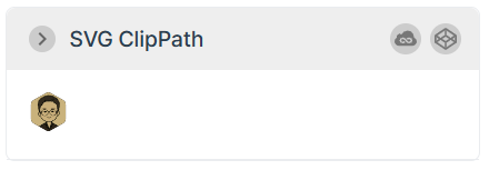
SVG로 육각형 프로필 만들기
<svg
  xmlns="http://www.w3.org/2000/svg"
  width="2.25rem"
  height="2.25rem"
  viewBox="0 0 36 36">
  <clipPath id="hexagon-clip-path">
   <use href="#hexagon-path"/>
  </clipPath>
  <path
   id="hexagon-path"
    style="fill: #000"
    d="M15.5 0.65470053837926a4 4 0 0 1 4 0l11.58845726812 6.6905989232415a4 4 0 0 1 2 3.4641016151378l0 13.381197846483a4 4 0 0 1 -2 3.4641016151378l-11.58845726812 6.6905989232415a4 4 0 0 1 -4 0l-11.58845726812 -6.6905989232415a4 4 0 0 1 -2 -3.4641016151378l0 -13.381197846483a4 4 0 0 1 2 -3.4641016151378"
  />
  <image
   clip-path="url(#hexagon-clip-path)"
    width="100%"
    height="100%"
    href="https://user-images.githubusercontent.com/17817719/258330341-480ae4d2-8071-4bf7-b8b6-7cac9b86c1a1.jpg"
  ></image>
</svg>
1. path 태그로 육각형 모양 만들기
2. image 태그로 프로필 이미지 사용
3. clipPath로 path 바깥 영역 자르기
CSS Mask로 육각형 프로필 만들기
<!DOCTYPE html>
<html>
<head>
<style>
.profile {
width: 6rem;
height: 6rem;
mask-image: url('./hexagon.png');
mask-repeat: no-repeat;
mask-size: contain;
mask-position: center center;
-webkit-mask-image: url('./hexagon.png');
-webkit-mask-repeat: no-repeat;
-webkit-mask-size: contain;
-webkit-mask-position: center center;
}
</style>
</head>
<body>
<div class="profile">
<img
width="100%"
height="100%"
alt="profile image"
src="./profile.jpg" />
</div>
</body>
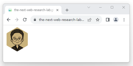
</html>1. img 태그로 프로필 이미지를 불러오고 크기를 잡아줌
2. 육각형 이미지로 마스크 처리
CSS로 불러오는 이미지는 CORS에 영향을 받기 때문에 같은 도메인을 사용하는 이미지를 사용한다.
데모 보기
728x90
'경험정리' 카테고리의 다른 글
| Swagger 문서에 정의된 DTO 코드 자동 생성하기 (0) | 2023.08.09 |
|---|---|
| 소프트웨어 버전 사용 경험기 (0) | 2023.08.07 |
| Color Space 시리즈 - LCH LAB (0) | 2023.07.20 |
| Color Space 시리즈 - HSL HSV (0) | 2023.07.20 |
| Color Space 시리즈 - 먼셀의 색체계 (0) | 2023.07.20 |